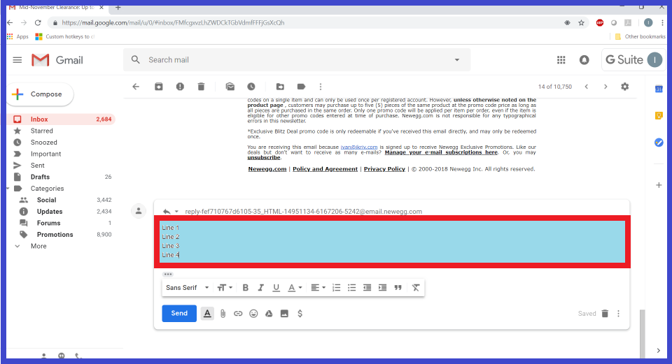
In the last month or so I realized that I am having difficulty using GMail. I could not put my finger on it, until it hit me: look at the size of the reply text entry field!
It occupies just 15% of the screen height, and can barely hold 4 lines of text! I have a decent screen resolution of 1920×1080, so that can’t be the reason. Reducing the font size does not help: the window becomes even smaller. I have more input lines of text on my cell phone than on my 24″ desktop monitor! Oh yeah, and the web page has 40 (forty) clickable thingies around the screen, half of which have nothing to do with e-mail.
I am sure it was not always so bad, it must have gotten worse over time. And GMail is not alone, I see other web sites developing stupid usability issues as well. I am not sure what to make of it. Is Web becoming too complicated for developers to program? Is it the result of cost cutting and outsourcing? Or we have too many browsing devices that are too different? Or simply nobody gives a damn anymore? It’s hard to tell…